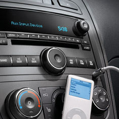
A positive trend in cars as of late is to include an aux input on the stereo. Many sell this as an iPod input, but it will work for a Zune, Dell Ditty, whatever. Here you see the dash of a Chevy SSR.
Now that the ball is rolling, how about we ditch the cigarette lighter power jacks and just go with USB? Tons of phones, music players, and other gadgets are capable of being charged over USB. I know it would put a hurt on the folks selling lighter adapter cables, but this is about the consumer :)
If you're a smoker, you can buy an adapter that plugs in to USB to light your cigs!
I really don't care if the USB is hooked to any data network. I'd imagine it wouldn't be for quite some time. I'm just looking for convenient charging solutions that don't require cable double-ups.
Add some bungees to the top of the dash and your gadget could charge without flying around the car.
2006-11-28
USB in the Dash Please
2006-11-27
Staring at the Start Menu
After reading Joel on Software's post about the Vista shutdown menu, I was moved to stare at the XP start menu for a bit. I wondered what I did and didn't like about it.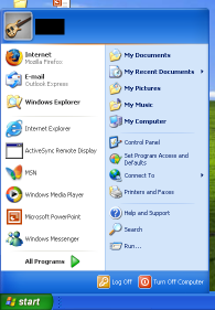
For reference, here's a mostly default XP start menu.
You can see that my default browser has been changed to Firefox and I've run a few programs which show up as frequently used.
Overall, it's not too bad. The placement of the All Programs probably makes sense because if I used the program alot, it would be in the recent icons, or perhaps an entry in the Quick Launch bar. One bad thing is the amount of crap that is shown by default. More on that in a sec.
My first WTF comes when you move the Start button to the top or the side. You can see that the menu doesn't change in the slightest. That's really odd to me because your mouse pointer is now approaching the menu from a complete different direction. It seems that the items would be rearranged to reflect this new orientation.
If the orientation doesn't matter, then the menu isn't designed for repetitive use and would lean towards being pretty rather than functional, wouldn't it?
The Start bar down the left of the screen is the orientation that I run on widescreen and dual-screen setups. I find this to be the only way to get reasonable window titles so I know which window to pick when I have dozens of them open. It's interesting that I don't have this problem when I use expose with the Mac.
You can see that you have to mouse past a giant username header on the menu every time you access the menu. That seems like a usability no-no to me, especially on home systems that probably only have one user. You can configure most of the rest of the menu. Why can't you turn the login name banner off?
I put my image editor where my mouth is and mocked up a flipped start menu. It isn't pixel perfect, but you get the idea.
I also configured the menu to a simpler presentation. I'm not sure I've ever accessed Set Program Defaults and Access, so I'm pretty sure I don't need it every time I click Start.
After looking at this for awhile, I find that I prefer the original start menu, but in the drop from the top orientation. If I could get rid of the login banner, I'd be all set. Things that I use least, like Turn Off and All Programs are far from the mouse pointer, which is good. Things like Internet and Mail are within ease reach.
I haven't actually tried out Vista yet, but it looks like things aren't much better there. Perhaps it allows more configuration. I'll let you know :)
2006-11-25
5 of The Now
I'm in one of those funk, breaks, gritty brilliance, kind of moods. We have some old, some new, and some old that is being rereleased anew.
- Sound Directions - Dice Game
 Funky! Drums, horns, is that an oboe?
 - Latryx - Lady Don't Tek No Lateef and Lyrics Born on the flow, DJ Shadow on the production. How can you go wrong? Of special note is the recently released live version!
- Incredible Bongo Band - Apache Ahh Apache. Much like the amen break, Apache has a long, storied musical history. I bet you a donut you've heard this break. Get a flavor of it at Wikipedia and soul-sides.com. Then check the list of songs that sample it. I feel like I've heard other uses and this is going to make me go digging in my collection to do a little sample spotting.
- Mandrill - Mango Meat
- Madvillain - Great Day (Four Tet Remix)
2006-11-16
What I Love About Safari
I like the Safari web browser. When I'm using a Mac, I prefer it, even when Firefox is close at hand. There are times when I must leave Safari (stupid web devs), but I'd say that 98% of my Mac surfing is in Safari.
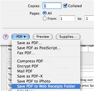
In addition to just working, there are a few features in Safari that bring extra delight. These aren't all unique to Safari, but Safari does rock them well.
- Save PDF to Web Receipts Folder - This one is brilliant. No need to roll your own method for saving those "Print this page for your records" pages. You can even skip the paper storage because the PDF will let you print one years later if you really need it.
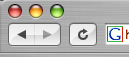
 Simple, clean, and minimal UI. From the back button to the integrated Google search, I don't think you could get it any cleaner. I remove the home button. That leaves back, forward, stop/reload, address bar, and Google search. Exactly what I need.
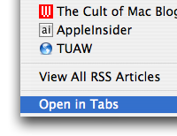
  Open in tabs - I use this on a daily basis. It is great for sites that don't have RSS feeds, or even ones that do that you prefer to browse directly.
 Fill forms from address book card - I love the tight integration. Other browsers will learn who they think you are. My computer already knows who I am, it doesn't need to guess.
 Sync bookmarks using .Mac - Yes, .Mac is probably too expensive for what it is, but I do like having my browsers on multiple machines keep the same set of bookmarks. This involves no mucking, where plenty of the other bookmark sync services do.


2006-11-13
Nine of Evil
As you know, Evil Nine is one of my favorite artists. In tribute to them, I put together an Evil Nine based DJ mix. It's 9 tracks (how clever) that are all Evil Nine related in some way, be it their tracks, their remixes, or remixes of their tracks.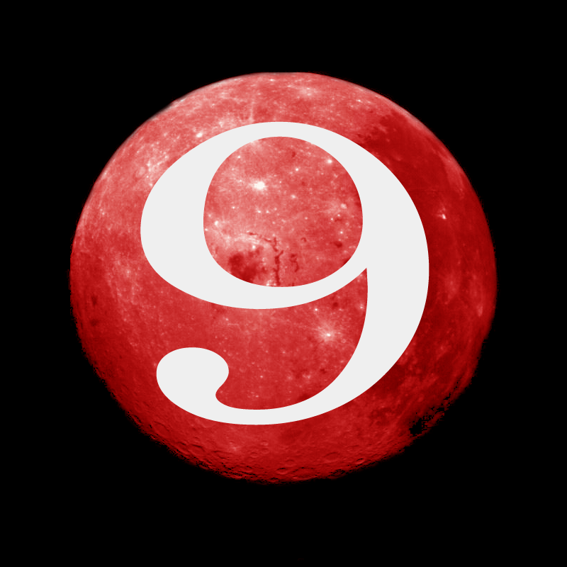
I'd hoped for a Halloween release (again, evil, clever, yes, I know), but it took a little longer to find the time.
Tracklisting:
- Evil Nine - Crooked
- Timo Maas - Pictures (Evil Nine Remix)
- Ursula Rucker and Will Saul - Where Is It? (Evil Nine Remix)
- Evil Nine - Restless
- Evil Nine - We Have the Energy
- Santos - Sabot (Evil Nine Remix)
- Stone Lions - Immigrant Heel, Claw, & Toe Lovers - Whoah!
- PET - Superpet (Evil Nine Remix)
- Evil Nine - Cakehole (Midnight Son Mix)
If you want to give it a listen, let me know.
ChapterTool Error
If you get the following error using ChapterTool, check to see that your image pathnames exist. If they don't, or you have one spelled wrong, ChapterTool will fail. I learned this the hard way.
ChapterTool 2.0b8 (4)
Copyright (C) 2005, Apple Computer, Inc., all rights reserved.
ERROR: Couldn't add chapters to movie (-43)
status: failed
code: -43
2006-11-12
5 of The Now
- The Remote - She's Going Out Tonight One of my favorite albums of the year. It's electronic, but has tinges of rock that should make it accessible to those that like bands such as the Killers, Panic! at the Disco, and the like.
- Hard Rock Sofa - Spatial Pleasure Uplifting and groovy. Hear the full track at their Myspace and then go buy it at Beatport.com.
- Fedde Le Grand - Put Your Hands Up for Detroit Good, floor-filling fun. If you like nurses, be sure to check out the video.
- James Holden - 10101 Amazon is still playing games with this release. They cancel my order. They raise the price. They say it isn't available. For now, I listen on the Myspace site.
- Eddie Temple-Morris - Snow Patrol vs. Loser More rock infusion.
2006-11-07
Motorola Chargers For All
Unfortunately, this post will fail to be even mildly interesting to most. I just need to inject some knowledge into the Internet. I believe Jason calls these Googlecaches.
You'll remember that I bought the Motorola DJ Bluetooth Headphones and got stuck with a UK power supply. I took a shot and bought a Moto supply from Amazon that I thought might work. 
Sure enough, it arrived and provides 5V/550mA which is exactly what the supply that came with the headphones provides.
The Moto part number is SPN5185A. You can find it for less than $2 at Amazon and other places on da information superhighway. You'll spend more to ship it than buy it.
For reference, this supply is supposed to work with the RAZR V3 and KRZR K1/K1m. Using the transitive property, this supply should also work with the Moto HT820 Bluetooth Headphones.
2006-11-06
Swoon for Zune?
Engadget has a fantastic walkthru of the Zune. After watching that (twice), I think the Zune may have some staying power.
Here's what I like:
- Track flags - Yes, I happen to like this idea. Good job Microsoft.
- RDS - I don't really care for radio in my portable music player, but if it is in there, it's great that it makes use of identifying data that is available.
- Progress Bars - Ok, they don't work any better than an iPod, but they look snazzy!
- Pre-rated music - Just like Amazon and Netflix, items are pre-rated based on what the rest of the world thinks. This might help organize your music, and hopefully the pre-ratings get better as it knows more about you, like Netflix does.
- Backgrounds - This could look really bad, or it could be a nice way to customize your player. I say thumbs up.
- Brown - I like the brown color. No one else seems to, but I do.
What I don't like:
- Search everytime on wireless sends - This is terrible. If we've learned anything from Bluetooth, it's that recently and frequently used devices are good to remember. It is just silly that you have to search for the wireless device to send to every time you choose to send a file. Sending 10 items back to back? Looks like the Zune will make you search 10 times. Yay.
- No wireless sync - I don't really care that you can't buy music wirelessly. I'm more concerned that a (mainly) infrastructure technology is being used for peer to peer activities, and is not being used for wireless syncing. Unless I'm missing something, I have a Wi-Fi network, but I can't use it to sync with my Wi-Fi enabled Zune? What's up with that? If I want to burn my battery, that's my business. Microsoft must have other plans for the Wi-Fi. If they don't, why didn't they use Bluetooth 2.0? I'm curious to know the techincals of the search procedure that Microsoft is using. How does a Zune make itself discoverable and how do the other Zunes go find it?
- Cluttered - It isn't too bad, but the heading chains across the top are confusing. I still don't see what they're trying to tell me.
2006-11-03

2006-11-01
iTunes thinks I moved
Click the iTunes Store link, page loads, text in Japanese. Well that's odd. I'm not sure how my store preference got changed. I don't remember clicking that box at the bottom. In fact, I can't say I remember there even being a box at the bottom to change the store I wanted to browse. 
Changing the store location does seem like an interesting way to explore the music that is popular in other parts of the world. I think I'll give it a try, but for now, I just set it back to United States :)