I'm pretty meh on Safari 4 so far. The top sites thing isn't something I'll use. Coverflow previews are neat, but haven't used them. Tabs on top are ok, but I'm finding myself confused. Here's how.
If you have a window open, with tabs, and then click a link that opens a new window, Safari creates that window in such a way that the tabs from the old window appear attached to the new window! 
Yes, there's a line here that is smooth in the regular window, but this interface is new. My brain doesn't know that yet. Second, it seems there is a slight color variation with the active and inactive windows. I'm sure that's great if you aren't colorblind. Doesn't do jack for me.
This is bad because I try to click the tab that I think belongs to my window, but it doesn't. It seems Apple could fix this by simply creating the new window 5 pixels lower, or higher.
2009-03-09
Safari 4 UI Confusion
2008-02-20
Hello World - iPhone Style
I'm excited about mobile development again. I'm eagerly awaiting the iPhone SDK and while I wait, I figured I'd at least try some iPhone development in its current, web development, form.
I'll post about what I made in a future post. For now, I just wanted to link to some of the things that got me going.
Apple has some great developer resources, including the iPhone Dev Center. I'm not sure why they hide them all behind a login curtain, but they do. Once you create (or buy) an ADC login, you can access 2 hours worth of videos about iPhone development. The videos range from UI elements to how to simplify your app for smaller form factors. Even if you have no interest in Apple and the iPhone, you might enjoy the usability aspects of the talks. Most of the concepts apply to Windows Mobile, Palm, Symbian, and other mobile development. If you watch and it all seems like common sense to you, good, you are better off than most developers that build UIs.
If you're ready to start building right away, look no further than iUI. iUI is a great framework to build web based apps that look native to the iPhone. Within an hour, I was able to build a great looking, highly functional, app using iUI. I tweaked the included CSS a bit to include some further button samples I found at the iPhone Dev Center. Thanks go to Joe Hewitt for his work on iUI.
Finally, if you want to follow some discussion and get some links to other apps people have built for the iPhone, head over to the iPhoneWebDev Google Group.
Tick tock on the SDK clock.
2007-11-24
Inconsistent Time Sliders
One of my favorite features for the new DVD player in Leopard is the time slider that hides in the bottom frame of the window. I like that it gets out of my way when I don't need it, but it is still right there when I do.
If you read yesterday's post, you'd know that I'd notice that this time slider is different than other time sliders that Apple uses in a default install. I wanted to explore this further, so I grabbed some screen shots from time sliders in various apps.
Wow, that's a lot of differences for such a simple user interface component.
- Diamonds vs. triangles vs. dots for time line indicators
- Time text at the end of bars vs. under the bar vs. none at all
- Play indicators vs. none
- Hours placeholder vs. none
- Controls with the same icon, but different treatments (volume, full screen, play, pause, skip)
- Different colors, different transparencies
- Even silly things like rounded vs. squared
Of course not all of these differences are bad. It makes sense for the transparencies in some apps vs. not in others. QuickTime is also showing its age. The thing I want to know, is what's the optimal placement of these controls? Should Quick Look and QuickTime share the iTunes time slider? Should DVD and Front Row be more similar? I didn't even show the iTunes Cover Flow controls which, while not a time slider, still has many of these same controls and presents them differently yet again.
There has to be a better way to do these sliders, if for no other reason than to make them familiar to users across applications. Do you agree? Please discuss.
2007-10-11
Wasted Taskbar Space
A UI discussion broke out at work and I couldn't resist documenting these complaints.
In XP, I put my taskbar on the side because that's the only way I can read any of the descriptive text for running tasks. Without a decent task switcher in XP, I rely on what little text I can see. The problem is that the Start button doesn't change size, even though it has plenty of room to expand with the width I give to the Taskbar. I have a blank area, nearly as big as the Start button, that is worthless, wasted space. Seems to me that Microsoft should just extrude the Start button to fill the space. This saves me time as I don't have to go as deep into the corner to hit the button. It's also easier to hit because it is bigger which allows quick, sloppy mousing.
A similar issue exists in the notification area. I like having the date available on a quick look, but I don't need the day of the week, and I don't need huge empty areas around the information because the column is wider than the info. Compress that down and give me space for one more task entry to show before it switches to a two column display (which again makes the descriptive text worthless).
2007-09-06
The Other iPod Dock
It's not the thing that goes on your desk. It's the thing that now looks more like your desk, with icons on it.
The new iPod touch dock doesn't match the iPhone. Instead, it matches the new dock coming in Leopard.
Isn't it funny how Apple can make basically identical products look different? The do the same thing with apps. Aqua, brushed metal, dark gray. Ugg, it annoys me.
2007-04-25
Perils of a Bootcamper
Today, just a tale of woe for those of us that spend time on both sides of the OS fence.
As you know, Watch Now from Netflix requires Windows and IE. So, I'm on the MacBook, booted into XP and half way through a film. A scene of quiet dialog came on and I reach to turn up the volume.
F5. That's an evil key. My MacBook brain thinks volume up. My web browser thinks refresh. Click click. Ohh, look, my movie is gone. It's negotiating to transfer the movie again. Fantastic.
Stupid F5 key. Stupid Watch Now player. Stupid keyboard overlay that doesn't match the actions. Grrrrrr.
2007-04-16
Intel Inside...the TV
Mark Cuban has a post up at Blog Maverick discussing HDTVs as PCs. As to computers in the TV, I agree 100%. It just has to happen. Computers are now amazingly cheap and TVs are getting amazingly complex, or at least the stuff they need to display is getting amazingly complex.
Mark did say some things that had me shaking my head though.
Remember when you would buy a new PC every couple years to keep up and you would buy a new TV every decade ? Well thats about to reverse itself. You no longer feel the need to get the latest and greatest desktop PC, but you are about to get in the habit of upgrading your TV every couple years as new and original features and applications are developed for it.
Yes, I remember the computer treadmill. A new one every 2 or 3 years, just to be able to run what was current. There's no way I'm going to do that with TVs, especially TVs that now cost in the thousands, not the hundreds of dollars.
In 3 years the mainstream TV will be 70" and cost less than $1500. In 5 years, it could be 100" for $2500 dollars . Yes, you will make room for it. You will redesign the family room or your bedroom to make room.
I'm guessing Mark's house is a little bigger than mine. There's no way I can fit a 100" tv in either my family room or my bedroom. It might fit downstairs in what can be a home theater room, but even then, 100" is gigantic and you need to sit a long way away from that screen. People aren't going to build bigger houses to hold their bigger TVs. At least, not the masses.
So back to the computer in the TV. Absolutely, I want this. If you've seen an Apple TV, your first thought is Why can't they just cram that in the back of the LCD? I wonder if the current Apple TV is the first in a family of products. It doesn't take much imagination to picture a 30" Apple display with an Apple TV built in.
Apple isn't the only company that can make this happen, but they appear to be one of the few that care. The on screen menus of many of todays DVD players, receivers, and HD tuners look like they were designed by engineers. They navigate like they were designed by engineers. They frustrate the crap out of their users. In case I'm being too subtle, most engineers can't design UIs. The ones that can are usually designers.
Part of the reason they suck so bad is that they're written in low level languages running on very basic display hardware. It takes a lot of effort to make stuff look good with those resources. Contrast that with the Apple TV. It's a full-blown computer running a full-blown OS that can make use of full-blown development tools and techniques. The Apple TV costs $300, but that's not that much more to pay on top of a TV that already costs $3000. I say build it in. You might think this leads to the upgrade path that Mark suggests. I'd like to think the opposite. Build in some general purpose hardware and let folks at it. Look at all of the new functionality that has been built on the Apple TV. Look at the tremendous work done to add functionality to routers with the DD-WRT project. If you open it up (intentionally or not), they will build for it.
Let me run widgets on my TV. Let me cut out the weather warnings with stylesheets for TV. Let me build a channel guide that doesn't suck.
It seems to me that this is what Mark Cuban would want, and I think he does. He wants people to continue to sit in front of their TVs and watch HDNet. To keep them there with compelling user experiences. He even points out some of the ways that features are being added to TVs. However, pay attention to the subscription fees for services like caller-id on your TV though. I don't want a plan for my TV!
So, to sum it up, TV manufacturers need to build up the development capabilities of their TVs. Focus on the experience. Focus on the interface. Do these things and you'll get my dollars.
2007-03-08
Some of My Recent Documents

The recently used documents feature is a good thing. I like having it in apps. I also like having it available system wide. Unfortunately, it always seems like the file I used recently doesn't show up on my recently used documents. I got tired of wondering why some files didn't show up in the list and did some quick checking. Here's a list of what will and won't show up under XP's Recent Documents.
| Bluetooth File Transfer Out | No |
| Bluetooth File Transfer In | No |
| Copy/Paste from Network Computer | No |
| File save from Firefox | Yes |
| File save from Internet Explorer | Yes |
| Attachment save out of an Outlook email | No |
| Copy from flash card to C: drive | No |
| Copy/Paste from Network Computer | No |
| Rename a file | No |
| Open a text file in Lemmy | No |
| Open a text file in Notepad | Yes |
Now certainly a random app's inability to add to the Recent Documents list isn't Microsoft's fault. They document the API to use.
The part that bothers me is that the rest of these tasks don't result in the file on the recent documents list either. I can't tell you how many times I've copied a file or saved an attachment and then went CRAP, where did I just put that. Why can't these show up on the list?
While we're at it, why can't recently changed files show up differently in the File Explorer for a configurable period of time. Download a file, open the folder, and then spend 30 seconds scanning the files trying to remember the name of the thing you just downloaded. Maybe I'll have to write my own Bluetooth file transfer client so I can populate that list myself.
If anyone reading is running Vista and can check to see if any of these behaviors work differently, I'd appreciate it.
2007-03-07
Play Bar Brothers
I realize there aren't a whole lof of ways you can design a play bar, but I did think it was interesting to see how similar the Netflix Watch Now and iTunes Fullscreen Cover Flow play bars are.
The order is the same. Play/pause, scroll bar, volume, and then full screen control.
I actually like that these are similar. I don't want to learn a new layout for every app I use.
2007-02-17
Be Concise, Be Consistent
Some people wonder why other people can't get the hang of computers. They find using computers to be pretty easy and can't fathom why others have such a hard time with them. I'm not one of those people. Plenty of people think computers are hard because they are. They're complex, they're confusing, and the worst part is that simple investments at design time could go a long way towards making them easier to use.
Today I'm going to pick on Foxit Software, makers of the great, free, PDF reader for Windows. Like many of you, I grew tired of the bloat in Adobe Reader and decided to try things without it. While installing Foxit Reader, I was presented with an installer that, on the surface, looked just fine. However, if you take a gaze with a critical eye, you'll notice plenty of things that us geeks just accept but confuse the crap out of non-technical users.
In the first screenshot, we're being asked to choose a folder to install our application to. A reasonable default is preselected.
My problem is the Disk Space section. First off, what's a disk? I thought we were picking a folder? Then we see some stuff about total disk space and free disk space. I'll be honest, I've seen these things hundreds of times but at first I thought the total disk space was how much the app was going to burn!
It took me a bit to notice that the "disk to use" info was down in another section of the window. Why is the focus of this window the disk space indicator? Shouldn't the focus be the folder to install to and the disk space required? They don't even give me any indication if the selected disk has the appropriate room to install. I guess I could do the math, but wait, can I? I see I have 2205 MB available and the app is going to use 2.5M. Now, I know they are using the same units here, and you know they are using the same units, but do non-technical users know that an MB and a M are going to be the same in this case?
Why didn't they use the same units? Why did they include a space on one and not the other?
In our second screeshot we see something called a destination location. What's that? I thought I just picked an install folder. If you want to call it a destination location, then ask me to pick a destination location, not an install folder.
Now, a lot of you have already cursed at the screen and decided that I'm overly critical. If you have, good. I writing this post to you. This stuff does matter and it does confuse people. It would have taken about 20 seconds to have changed the installer at design time to use consistent terminology and put focus on the things that needed focus.
2007-02-14
IE7 UI Blunders
I've used IE7 for a little while now and it's high time I complained about it! :)
For the first round of complaints, I'll address my UI hot button. Here's where I think they made some blunders.
- Separate reload and stop buttons - I think these should be the same button.
- Reload and stop buttons not near the page navigation - This one bothers me the most. These buttons are frequently used while going back and forward. Right now, they're hanging out in no-man's land between the location and search boxes. Why are they there? I don't understand the placement.
- Can't change the size of the address box - Anything beyond the first 20 or 30 characters is just script arguments and other junk that means nothing to users. IE7 makes sure you see it all.
- Can't change the size of the search box - Longer searches are useful to see. I could find no way to make this box bigger. Making the window bigger only makes the address box bigger. Safari lets you slide between these two boxes. A bigger search equals a smaller address. Perfect!
- Drop box on home button - How often do I need to change my home page? Almost never. How often to I go to my homepage? Dozens of times a day. How often would I miss the home button by 2 pixels and get the silly drop-down? Often.
- Multiple home pages? What's the difference between an additional home page and a regular link? Why couldn't I create a Home folder of links if I wanted multiple home pages? Maybe the Microsoft guys, with their huge net worths from cashing in stock are under the impression that most people have multiple homes and therefore need multiple home pages. I have microsoft.com for my Redmond estate, weather.com for the beach house in Maui, and skireport.com for the Whistler condo. Aww, the more I thought about this, the more I thought it might be a cool idea, but I pretended it wasn't long enough to write the Whistler condo joke.
It's not all bad. I love the blank piece of tab that you click to make a new tab.
2006-12-21
I don't get WMP
Maybe it's all of that Apple kool-aid that I drink, but I just don't get Windows Media Player. I don't understand the design. I don't understand where I need to click. I don't understand why it has so many different viewing modes. I don't understand why it can't handle it's own invisible border properly when you drag it around. I don't understand the handling of the timers.
I like to see the timer display time left on the track. Most players represent that with a negative sign. -00:09 tells you that the track will be up in 9 seconds. Windows Media Player doesn't use the negative. The difference between counting up and counting down is...well there is no difference. You have to watch the counter long enough to figure out which way it is counting to know what mode you last left it in. Maybe not a problem to you, but I don't use it alot, and it's a problem to me.

While I'm clicking around trying to figure out the counters, I see something quite odd. The timer disappears and relocates to the title-bar, well the fake title-bar anyway. They show the time in a completely different way up there. More choices have to be better, right?
To recap, WMP starts by counting down. Click it and it will count up. Click it again and it will jump to the fake title-bar and count up. It seems you can't get it to count down in the fake title-bar. Less choices have to be better, right?
The real craziness is the poor little shuffle icon that gets sucked up in the mess. When the counters are down low, you get an icon to control the shuffle modes. When the counter jumps up top, the shuffle mode icon goes on break! It doesn't jump to the top. It just diappears completely! Now you have a blank area that could still have the icon, but it doesn't. No choice has to be better, right? (yes, you can still get to it in the menu...if you can figure out how to pop a menu)
Finally, just to make you slap your head one more time...if you "Show Menu Bar", you'll get a real title-bar. If you go do your click dance on the counters now, the counter and shuffle icon will disappear completely. It doesn't pop to the title-bar. It disappears and you can't get it back until you switch to fake title-bar mode and click. I seriously can not find a menu or right click way to get it back. You have to switch modes and click.
Can anyone justify this behavior? What use case am I missing?
2006-12-18
Click the X

I took 5 minutes to see how many different close buttons I could find in some pretty standard apps. Luckily it's hard to make an 'X' look like anything other than an 'X'.
Top to bottom
- Google Talk
- Microsoft Word
- Microsoft Command Prompt
- Microsoft Windows Media Player
- Apple iTunes
- Roxio Easy CD Creator
- Cyberlink PowerDVD
I'm sure you can find more. Part of me hates that there are so many different versions of the same thing. Part of me understands that some apps want to have an identity or use different GUI libraries. The rest of me just puts up with the non-standard standard controls.
2006-11-27
Staring at the Start Menu
After reading Joel on Software's post about the Vista shutdown menu, I was moved to stare at the XP start menu for a bit. I wondered what I did and didn't like about it.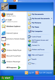
For reference, here's a mostly default XP start menu.
You can see that my default browser has been changed to Firefox and I've run a few programs which show up as frequently used.
Overall, it's not too bad. The placement of the All Programs probably makes sense because if I used the program alot, it would be in the recent icons, or perhaps an entry in the Quick Launch bar. One bad thing is the amount of crap that is shown by default. More on that in a sec.
My first WTF comes when you move the Start button to the top or the side. You can see that the menu doesn't change in the slightest. That's really odd to me because your mouse pointer is now approaching the menu from a complete different direction. It seems that the items would be rearranged to reflect this new orientation.
If the orientation doesn't matter, then the menu isn't designed for repetitive use and would lean towards being pretty rather than functional, wouldn't it?
The Start bar down the left of the screen is the orientation that I run on widescreen and dual-screen setups. I find this to be the only way to get reasonable window titles so I know which window to pick when I have dozens of them open. It's interesting that I don't have this problem when I use expose with the Mac.
You can see that you have to mouse past a giant username header on the menu every time you access the menu. That seems like a usability no-no to me, especially on home systems that probably only have one user. You can configure most of the rest of the menu. Why can't you turn the login name banner off?
I put my image editor where my mouth is and mocked up a flipped start menu. It isn't pixel perfect, but you get the idea.
I also configured the menu to a simpler presentation. I'm not sure I've ever accessed Set Program Defaults and Access, so I'm pretty sure I don't need it every time I click Start.
After looking at this for awhile, I find that I prefer the original start menu, but in the drop from the top orientation. If I could get rid of the login banner, I'd be all set. Things that I use least, like Turn Off and All Programs are far from the mouse pointer, which is good. Things like Internet and Mail are within ease reach.
I haven't actually tried out Vista yet, but it looks like things aren't much better there. Perhaps it allows more configuration. I'll let you know :)
2006-09-23
Vista UI Guidelines
Microsoft has posted their UI guidelines for Vista. I like what I see. The guidelines make sense, mostly. Hopefully developers will pay attention. Here are a few that I liked from the two sites.
- Don't spend time rebuilding standard UI components; use that time instead to innovate in meaningful ways based on your core competencies and understanding of your customer needs. I hope this is aimed at the Media Player team. What is up with them moving the entire menu structure over to the right and having window frames that can pop up when you hover in the area. The whole thing makes my head hurt.
- Use positive commit buttons that are specific responses to the main instruction instead of generic labels (such as "OK"). This seems new. I thought they always wanted us to use a standard "ok". I like the new recommendation.
- Consider cleaning up your dialog by using a More Options "expando" button, so advanced or rarely used options remain hidden by default. I'm conflicted on this one. I like the hiding of options. Hiding complexity allows the owner to manage the expectations themselves. However, the self-slimming menus in XP bug me sometimes. Too often I find myself searching for items in the menus and I have to keep hammering that expand icon. It works great most of the time though. It will be interesting to see this in settings UI. It will be a lot like "More options" or "Advanced options", but quicker to access, and possibly less confusing because you won't leave the current options, you'll just be shown more.
- Don't use Congratulations pages at the end of the wizard that serve no purpose to users. I'm all for this. Should I count the number of current Microsoft wizards that do use congratulations pages? I own a few wizards at work. They do have congratulations pages, but they have valuable info about the process you just completed as well, so I feel a little better about it.
- Use Explorer-hosted, navigation-based user interfaces, provide a Back button This is interesting. Take a look at configuring account settings in Outlook. You can pop 3 windows by the time you get to a setting you want. This gets a little confusing. I think folks understand the back button now after years of use in web navigation. I agree that the back concept could work in application configuration. It's almost like a wizard, with previous and next, but more Web 2.0 (yes, that's a joke).
- Support "Instant search" wherever possible to show instant results while the user is typing. Yes, yes, yes, yes, yes, please do this. Do you know how often I pray to the UI gods that Windows File Explorer magically sprout an instant search box in the top right so I can do live filters like I can in iTunes and iPhoto? I usually know something about the file I'm trying to find in a folder. Help me help myself and put in instant search!
- Use the Windows Vista "tone" to inspire confidence by communicating to users on a personal level by being accurate, encouraging, insightful, objective, and user focused. Don't use a distracting, condescending (for example, "Just do this..."), or arrogant tone. This one is just funny. File not found, jerk.
- Avoid repetition! Review each window and eliminate duplicate words and statements. No comment, just a link.
- Perception is reality, and if your customers don't experience quality in your product throughout, they may conclude there is lack of quality everywhere. The geeks don't like to hear this one. They like to pretend the rest of the world is a bunch of geeks too. They think it shouldn't matter that you shower, or wear clean clothes. It's the quality of the work that counts. Well, it is the quality of the work, but if you look like crap, maybe they've already made some assumptions about quality. I'm not saying it's good to make assumptions. I'm saying that people do. Just like you don't have to wear designer clothes to look good, you don't have to hire a designer to make your app look good. Line up your text. Use some consistent spacing. Use clean graphics.
- Don't restart progress. A progress bar loses its value if it restarts (perhaps because a step in the operation completes) because users have no way of knowing when the entire operation will complete. Here's hoping the Vista installer works different than past Windows installers. I seem to remember a non-stop restarting of menu bars during those file copies.
- Present choices and settings in terms of user goals, not technology. I preach this one at work and get the "you're a moron" look more often than not. I believe in it strongly though and have converted a few folks. I wish more developers would consider their apps all the way to how the user will use it, not just to the point where they've exposed everything to the user to use if they can.
- Wizards aren't "dumbed-down" UI. Many of them are, but they don't have to be.
- Don't use "wizard" in wizard names. Good recommendation. I think I'm guilty of this.
While we're on the topic of UI, I'd like to offer up observations on a couple of brain dead ones.
Office now opens separate task bar entries for each open file. This allows for nice alt-tab switching. Too bad you can't have more than one up at once so I can look at things side by side with my dual-monitor setup. Too bad the apps won't remember screen position per document. Dual-monitors aren't all that new, but you can tell that most app designers don't keep them in mind during their design.
Another problem with dual-monitors is dialog boxes that are centered in the window, not popped near the action that popped them. In other words, when click File>New, apps will pop a "Are you sure" dialog half way across my screen, usually
in the middle of the bezel gap of the two monitors. Centering dialogs in the app window used to work when screens were small and we only used one. There needs to be an option to pop dialogs in the upper left portion of an app window. That's near the menu items that usually trigger dialogs.
Many of the Slashdot comments on this subject revolved around Apple already using these recommendations. I'd have to agree in many cases, but they don't come clean all the time. I only need to mention one example, Finder.
What UI atrocities have you seen?
2006-08-14
Track Flags
Podcasts are continuing to evolve as a marketing tool. Puma is using music to spead the word about their frangrances. Beatport regularly puts out a wicked mix made from new releases. Even Apple releases a podcast once a week with new tracks that they'd love for you to buy.
For the most part, these marketing vehicles are doing their job. I've been moved to buy many tracks that I heard for the first time on a podcast. The problem is, they are too hard to buy.
Podcasts are certainly a step up from the old way. Downloading a DJ mix and then searching for a tracklist is a pain. Some will have a .cue sheet, but even then, you have to have software capable of handling that .cue sheet and doing something reasonable with it. For those keeping score, iPods don't know what a .cue is.
When I'm grooving away to Beatport Burners, I frequently think to myself "I need to buy this." If I'm at my computer, I can make use of the brilliant links that you can build in to podcasts, but I'm never at my computer when I'm listening to podcasts. I'm always listening on my iPod, usually at work. That means I get to play the game of writing notes to myself on scraps of paper, or dropping entries in my Google Notebook. Surely there is a better way.
We need a solution for flagging tracks on our iPods. Microsoft's Zune is already rumored to support bookmarking of shared tracks. If Apple wants to justify the development time, they can mark this in the increased iTMS sales category, but certainly we'd have reason to flag tracks other than as a future purchase reminder. I can see flagging tracks to use in iPhoto slideshows, for use in a DJ set of mix tape you are working on, or even as one you'd like to email Jimmy about because you think he'd like it.
My suggested implementation borrows on UI that most users are already familiar with. First of all, I borrowed the flag icon from Mail.app. Most users are familiar with flagging important emails for further future action. I also needed a UI gesture that could be performed on the iPod. Apple already lets you click and hold on a track to add it to an On-The-Go playlist. All they need to do is support that same gesture while on the track ID screen in a podcast.
- From the default podcast screen...button click to enter track ID mode.
- Click and hold. Flag icon is added to verify this track is flagged.
Later, back in iTunes, you can create a smart playlist with flagged tracks. If they had a link associated with them, you'd get the typical cirlcle-arrow icon to go to that link. If a link was not assigned, you'd at least have the information about the track that you'd normally scratch down on paper.
Here's hoping for this in iTunes 7!