After reading Joel on Software's post about the Vista shutdown menu, I was moved to stare at the XP start menu for a bit. I wondered what I did and didn't like about it.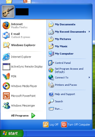
For reference, here's a mostly default XP start menu.
You can see that my default browser has been changed to Firefox and I've run a few programs which show up as frequently used.
Overall, it's not too bad. The placement of the All Programs probably makes sense because if I used the program alot, it would be in the recent icons, or perhaps an entry in the Quick Launch bar. One bad thing is the amount of crap that is shown by default. More on that in a sec.
My first WTF comes when you move the Start button to the top or the side. You can see that the menu doesn't change in the slightest. That's really odd to me because your mouse pointer is now approaching the menu from a complete different direction. It seems that the items would be rearranged to reflect this new orientation.
If the orientation doesn't matter, then the menu isn't designed for repetitive use and would lean towards being pretty rather than functional, wouldn't it?
The Start bar down the left of the screen is the orientation that I run on widescreen and dual-screen setups. I find this to be the only way to get reasonable window titles so I know which window to pick when I have dozens of them open. It's interesting that I don't have this problem when I use expose with the Mac.
You can see that you have to mouse past a giant username header on the menu every time you access the menu. That seems like a usability no-no to me, especially on home systems that probably only have one user. You can configure most of the rest of the menu. Why can't you turn the login name banner off?
I put my image editor where my mouth is and mocked up a flipped start menu. It isn't pixel perfect, but you get the idea.
I also configured the menu to a simpler presentation. I'm not sure I've ever accessed Set Program Defaults and Access, so I'm pretty sure I don't need it every time I click Start.
After looking at this for awhile, I find that I prefer the original start menu, but in the drop from the top orientation. If I could get rid of the login banner, I'd be all set. Things that I use least, like Turn Off and All Programs are far from the mouse pointer, which is good. Things like Internet and Mail are within ease reach.
I haven't actually tried out Vista yet, but it looks like things aren't much better there. Perhaps it allows more configuration. I'll let you know :)
2006-11-27
Staring at the Start Menu
Posted by ---ryan at 10:46 PM
Labels: simplicity, UI, Windows, XP
Subscribe to:
Post Comments (Atom)
No comments:
Post a Comment