Showing posts with label Windows. Show all posts

2008-12-07

Simple Lists

Keeping a list of things to do is something most everyone does. I certainly do. Crossing something off those lists is one of the most satisfying things I encounter in a day. Traditionally, I keep these lists on scraps of paper and consolidate to a larger, heavy (to signify importance), piece of paper every so often. This works, but it certainly has disadvantages.


  • Tough to share it with others or between home and work

  • Tough to save large archives, unless you want a box of scrap paper

  • Can't search it

  • Easy to lose


I've tried to take my todo list digital many, many times. Microsoft Outlook tasks, Microsoft Project, Google Notebook, _todo.txt in the root. These are all as capable as paper, but they all had drawbacks that never let them stick. I always went back to paper and pen.

Over Thanksgiving, I took some vacation. I've found that I enjoy my vacation far more when I have a nice list of things to do, (and get them done). Otherwise I find myself watching the Today show until mid-morning, doing nothing of real value all day, and next thing I know, the family is walking in the front door.

So one of my todos for my last vacation was to check out the software that I got in the last MacHeist bundle (listing here) that I never got around to trying. One of those apps happened to be TaskPaper.

I went in pessimistic, expecting to be deleting the app after a day or so. After a few minutes of checking it out, I decided to give it a go for the week with my vacation todo list. By day 2 I was hooked. The digital todo list was finally a reality for me.

I love the simplicity of the app. I love the tagging and tag based filtering. I love that it still feels satisfying to cross off a task. I love the amazingly simple data format rules that let the app style the data appropriately.

TaskPaper seems to have a good buddy in TodoPaper. TodoPaper has essentially the same design, but for Windows systems. I'm now using TodoPaper at work and TaskPaper at home. I'd love to see them add a way to sync them.

TaskPaper recently bumped to 2.0 and got even better. The interface got even cleaner and they added a great query language (not @done is a favorite).

The only real holdback on these apps is the price. $30 for each seems a touch much to me but I'd still buy it at that price. I'm very happy to have gotten my TaskPaper license in MacHeist and work bought the TodoPaper license. Free trials are available, as well as discount codes every now and then. Be sure to check the site blogs and the TaskPaper screencast for a discount.

2007-06-12

Save a pixel, plant a Safari

Safari for Windows is out. Overall, I like it. I don't know if it will overthrow Firefox as my default browser, but I'm giving it some time.


One of the first things I noticed was how tight the top of the browser is. Even with the menu bar that is normally on the top of the screen in OS X, Safari still takes up less space than Firefox and IE. The best part is that it does this without losing much usability. Between Safari and Firefox, menus are 1 pixel shorter. Buttons are 11 pixels shorter, so that's where the savings come from. Will I have more misses when I reach for the button bar? We'll see.

2007-04-25

Perils of a Bootcamper

Today, just a tale of woe for those of us that spend time on both sides of the OS fence.

As you know, Watch Now from Netflix requires Windows and IE. So, I'm on the MacBook, booted into XP and half way through a film. A scene of quiet dialog came on and I reach to turn up the volume.


F5. That's an evil key. My MacBook brain thinks volume up. My web browser thinks refresh. Click click. Ohh, look, my movie is gone. It's negotiating to transfer the movie again. Fantastic.

Stupid F5 key. Stupid Watch Now player. Stupid keyboard overlay that doesn't match the actions. Grrrrrr.

2006-11-27

Staring at the Start Menu

After reading Joel on Software's post about the Vista shutdown menu, I was moved to stare at the XP start menu for a bit. I wondered what I did and didn't like about it.


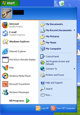
For reference, here's a mostly default XP start menu.

You can see that my default browser has been changed to Firefox and I've run a few programs which show up as frequently used.

Overall, it's not too bad. The placement of the All Programs probably makes sense because if I used the program alot, it would be in the recent icons, or perhaps an entry in the Quick Launch bar. One bad thing is the amount of crap that is shown by default. More on that in a sec.


My first WTF comes when you move the Start button to the top or the side. You can see that the menu doesn't change in the slightest. That's really odd to me because your mouse pointer is now approaching the menu from a complete different direction. It seems that the items would be rearranged to reflect this new orientation.

If the orientation doesn't matter, then the menu isn't designed for repetitive use and would lean towards being pretty rather than functional, wouldn't it?

The Start bar down the left of the screen is the orientation that I run on widescreen and dual-screen setups. I find this to be the only way to get reasonable window titles so I know which window to pick when I have dozens of them open. It's interesting that I don't have this problem when I use expose with the Mac.

You can see that you have to mouse past a giant username header on the menu every time you access the menu. That seems like a usability no-no to me, especially on home systems that probably only have one user. You can configure most of the rest of the menu. Why can't you turn the login name banner off?


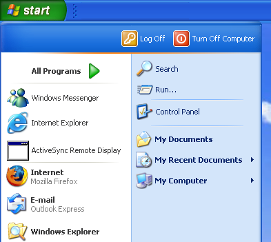
I put my image editor where my mouth is and mocked up a flipped start menu. It isn't pixel perfect, but you get the idea.

I also configured the menu to a simpler presentation. I'm not sure I've ever accessed Set Program Defaults and Access, so I'm pretty sure I don't need it every time I click Start.

After looking at this for awhile, I find that I prefer the original start menu, but in the drop from the top orientation. If I could get rid of the login banner, I'd be all set. Things that I use least, like Turn Off and All Programs are far from the mouse pointer, which is good. Things like Internet and Mail are within ease reach.

I haven't actually tried out Vista yet, but it looks like things aren't much better there. Perhaps it allows more configuration. I'll let you know :)