

My wife bought me this alarm clock from Target earlier this year. It's designed by Michael Graves. She said she got it for me because it looked simple. She was right and I love it.
I love the large numbers that are easy to read. I love the backlit display that only comes on when you need it, which is nice since the unit runs on batteries. I love that there is no power cord. I love that the backlight stays on for 10 seconds or so from a single push. This allows it to be a quick night light too to help you rearrange your bedding.
I love that there are only 6 buttons and they don't require a bunch of weird hold sequences. Alarm, clock, plus, minus, snooze, and on/off. Hold the alarm button to change the alarm. Hold the time button to...wait for it...change the time. Turn it on and you get clear indication the alarm is set. It's also small enough to take with you when you travel. I really love not having to worry that I didn't get the hotel alarm set right.
Best of all, it looks nice and it didn't cost much. A truly great product. I wish I could find more of them to buy for friends and family as gifts.
2008-10-29
Simple Time
2008-03-03
Shapes and Colors
Yes, this is another color blind post.
When the iPhone came out, I complained that their availability chart was poorly designed because it only used color to convey meaning. Even worse, they picked colors that are commonly known as colors that color blind people can't tell apart!
I was delighted to see today that they've made things better. The current availability chart for the MacBook Air uses colors and symbols to convey the meaning. Yay! The world is now a more accessible place.
Thanks to Engadget and TUAW for the source images for the above image.
2007-11-23
New, Different, Better?
I ran across a nice article about Sam Lucente, HP's vice president of design. Most interesting to me was this visual gathering of navigation controls in use on HP's products.
Most people couldn't care less about this sort of thing. Me, I can't help but notice. It amazes me to see product attributes that appear over and over, especially within the same company, end up being different. Is it because the engineering teams don't talk to each other? Is it because the teams suffer a bad case of not-invented-here syndrome? Is it because it gets designed by someone that isn't thinking about this sort of thing? Uhhh, yes.
The article also details how common design can save a company money. It makes sense to me. You can have a dozen engineers spend time designing a navigation control, supporting circuitry and software, or you can do it once and reuse. I'm not saying things shouldn't ever change, but I'd prefer the change be because the new iteration is better, not because someone felt like doing it their same and different way.
I'm with you HP and Mr. Lucente. I like your Q Control and hope to see it everywhere (because it isn't showing up on the iPaqs yet :)
2007-10-03
Ahh, That's Better
I couldn't stand that old theme. It was the best one at the time I picked one, but I never liked the images, and I never liked the column spacing.
If you happened to hit here in the past hour or so, you saw the old theme hacked up as I tried to expand the columns (for probably the 3rd time). It looked ok, but not great. I like the new theme a ton better. I swapped in my own color ideas, and I'm colorblind, so that's my excuse. Actually my blog looks alot like the walls in my office now. I reduced the title font. My goodness they wanted that big. I also chopped margins and padding here and there to tighten things up a bit, again, mostly in the title. You come here for the content, not for 20% of your screen saying "Thoughts Abound".
I also made use of Jason's trick to hide the blogger nav bar. I liked the "search this blog" function and found this new search box to replace it.
2007-08-21
Design Touches in Apple's New Keyboard
I'm such a Mac geek. Check out the desing touches of the new Apple keyboard. I have to believe the designers have a pile of Apple gear at their disposal and the design isn't done until it looks good with all of it.
It's old school, but I still use it. When I plugged in my shuffle to sync, I found it fit perfectly in the gap between the keyboard and the desk surface.
Far more folks will have iPod docks ready to plug-in. Notice how the USB plug housing blends perfectly with the keyboard lines.

I love it.
2007-07-29
Drumming Your Fingers on a Table
Engadget has a rumor and purported images of a keyboard said to be ready for the upcoming iMac from Apple.  The keyboard is stripped down to the bare essentials in materials but keeps the expected keys and even looks to add some function keys.
I'll assume this is the new keyboard. I like most of what I see. A few observations:
- The keys are like the ones found on the MacBook - I like the keys on the MacBook. Lots of folks dismissed the chiclet style keys, but I don't mind them. Then again, I don't mind the current Apple keyboards either, but if you read some Apple forums you'd find that plenty of people hate that keyboard. I used to be a keyboard snob and would only use a Microsoft natural board.
 I've since mellowed and even traded in my disgusting natural at work for a clean new Dell that seems to borrow some design cues from Apple.
 - No Apple key - The Command key currently has an Apple logo on it. The trouble is, the Apple is never referred to in documentation. Users are told to hit the command key and keyboard shortcuts list the feature key logo. This is very confusing for switchers. At least it isn't like the old days with the closed apple key and the open apple key. Anyway, everyone is crying fake on the keyboard because the apple logo is gone. I'll interpret it as Apple drinking some of their own simplify juice and getting rid of the confusing icon for the key that is never called the apple key. Wouldn't it be great if Microsoft did the same and got rid of the silly Windows key?
- Design - I like the clean design and the design looks like it will be easier to keep clean! While the clear plastic enclosure on the current Apple keyboard looks nice, it's really just a window display for dirt and crud.
- Design Part 2 - By refining the keyboard down to its simplest form, Apple may be opening the door for 3rd parties again. One of the side effects of Apple's minimalist design is the non-minimals (what kind of word is that?) will accessorize the crap out of it. Look how many billions of dollars there are in the iPod accessories market. Do you like your keyboard to slant forward? No problem. Someone will come out with a slab of plastic that this keyboard will click in to. Like more USB ports? Sure, how about a glowing blue enclosure with 6 USB ports out the side. Want an iPod dock in your keyboard? Seems like that would be easy enough to mold in the plastic as well. Now, you won't be able to change the curve of the keyboard, but if that's your style, you wouldn't be happy with this keyboard anyway and would already know what you like (see earlier comment about keyboard snob). This already happened with the Mac mini. Companies like Plasticsmith rolled out multiple products to fit your Mac mini needs.

In the end, if Apple can get you excited about your computer over $20 worth of keyboard parts, that's great for them. If they can't, then so what. You can pick from hundreds of keyboards out there.
2007-03-23
Apple TV is Worth It
2 cables and 2 minutes. That's all it took to get the Apple TV up and running. I connected power and the HDMI to my TV. I chose English, chose my wireless network, entered my password, and then entered the generated passcode into my Mac mini downstairs. That's all. I was live and living.
You probably don't like to read my paragraphs, so let me tell you why I'm loving the Apple TV in list form.
- Easy setup - I just covered that
- Tiny size
- Album art looks amazing. The "drifting" art screen saver is great. I could sit and watch it for hours.
- Menus are snappy and handsome - I don't know why people are saying the interface looks like crap. It's simple and sleek. What do you want it to be?
- Streaming is working great. The smallish hard drive doesn't seem to be a problem when the streaming works so well. For reference, both my iTunes library and the Apple TV are wireless.
- Syncing setup is simple, although slow on that first sync ;)
- It syncs your playcounts like an iPod! This might be my favorite feature so far. I know, I'm weird. If you think about this, it makes sense since it will sync only your unwatched shows by default, but since other playback of "shared" content doesn't update the playcounts (like playback from another computer over the network), I wasn't expecting this. I still need to see if streamed content updates. I know sync'd content does.
- Movie trailers start-up almost instantly. You could always do this in iTunes, but it was such a pain in the ass. Now you can be sitting in the family room with friends and decide what movie to go see as a group, right on the TV...without going and hooking up any other gear.
- Video podcasts - You'll hear folks saying the Apple TV doesn't do anything more than a video iPod with the video output cable. I agree, as long as you forget the fact that you have to leave a cable hanging from your TV for your iPod....and your iPod has to be charged...and your iPod has to be with you...and you don't mind running to the iPod every 3 minutes to start a new podcast...and you don't want to pause...and...and....hmmm, I'm writing paragraphs again :)
- Photos - I've sync'd photos to my ReplayTV before. It was great once they were there. Getting them there was terrible. Now I tick a box for the album I want and I'm done.
At this point, I'm definitely recommending this.
2006-10-22
Shuttle Like NES
I think the new Shuttle XPC X100 pulls some retro design cues from the NES.
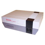
To see how similar, I made a morph between the two. I did some quick searching and found the MorphX to be a pretty nify application.
2006-10-04
A Smaller Target
Dear car/SUV manufacturers,
I like bikes. I like cars and trucks less, but usually end up using them more. Sometimes I take bikes places. That means I need a bike rack. If you'd like to gurantee I consider your vehicle as my next purchase, please build one of these bad boys in to your vehicle.
This is tremendous design. I hate having a rack hang off the back, but I hate taking it off and storing it in the garage even more. This might also save my precious bike rack. I had a silly lady try to rip mine off the back of my truck this summer. She used her front bumper. It wasn't pretty. I'd be pretty darn giddy if Nissan teamed up with Saris and put this in the next Xterra.